The Challenge
Meeting with Chappy Callanta of 360 Pro led us to discover the root problem — the implementation of their performance testing framework. The gym uses a Numbers document on one iPad to record all tests, and relies on inefficient manual procedures to do the work. The document calculates a total pro score based on an athlete’s performance for specific exercises, but the coach using it has to refer to several norms before assigning a pro score.

Group testing is impossible to do. Chappy says “I need to duplicate the Numbers document again and again for each testing session. It’s not ideal for groups of people who want to get tested.” In the end, the performance framework does not work because a unique tech solution to their problem does not exist.
Contextual Inquiry
To begin our systems analysis, we conducted site visits to 360 Pro. What we did was to get to know their process as much as possible and map out the actual data flows that happen. After interviewing their member coordinator and coaches, we discovered all the documents they use for a workout program for any athlete to begin. A more important issue was that Chappy was the only one using the performance framework, because they simply “didn’t get it” using the iPad Numbers document. It was a relatively new system and there was no way they would be able to grasp it right away.
At this point, we knew that the solution was making the performance system more accessible to all coaches at the gym, and create a system that is possibly scalable across future branches of the gym.
Feature Prioritization
I’ve done research on how personas and user stories might carry too many assumptions and have loopholes. I came across job stories
some time before and I wanted my team to implement it. According to Paul Adams of Intercom, “Job Stories are a different way of thinking about defining features, UI, and UX.” And so, being adventurous and a bit skeptical, we came up with our own. I think it helped us figure out the features we needed even more.

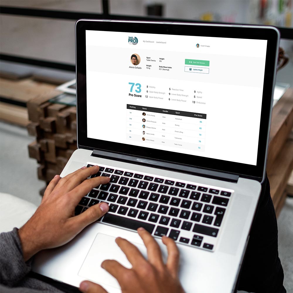
This was very early on in the process and it helped my team empathize with our primary users. This wasn’t really required by our instructor, we just went ahead and did it. The result was great for us, because we decided as a team on the design components we wanted to roll out: the performance testing core functionality, a leaderboard, a digital version of the gym’s Workout of the Week whiteboard, and general athlete user management.
Field Immersion

I learned about field immersion during my visit to UX Singapore 2016. I wanted to try out the idea for our project so I invited my teammates to actually try a gym session out, just to go to an extra level of empathy. Jacob Chua and I underwent the trial program, and we tried out best to empathize with the coach who was teaching us what to do. At that point, I was thinking of the possible ways I could make the system of testing easier, considering the situation we faced. I tried to create a mental model for the coach embedded into my subconscious.
Systems Analysis
We created a lot of data flow diagrams for the project, considering each process very carefully. We asked ourselves, how could we would create a usable and delightful product for the end-users, considering all these data flows? How would it actually translate to the product design? Considering the feature sets we decided on, what will be the best way to design them?
We also created logic models, use case diagrams and other documentation. This was all bulk of the coursework we were required to do, and I was more than excited to create the screens after all the prep work we were doing. During this process however, I felt that we could have done more user research really geared towards understanding the user more, like a usability test using low-fi prototypes.
Design Decisions

Making Testing Easier
Since testing was the main problem, we concentrated on designing that experience first. Using exercise cards that automatically compute pro score based on raw data while also considering gender norms, we focus the experience on actually just filling out information easily for the primary user. We wanted to eliminate cognitive load as much as possible.
Testing Summaries
The summaries should indicate whether an athlete has improved his pro score. We used a variety of visual design communication techniques to convey this.

Tracking Performance
Leaderboards and member dashboards will fulfill this aspect of the product. Search definitely plays a major role in the user experience of the app, and almost always populates all design components.
Next Steps
I will have to create a FramerJS prototype to simulate microinteractions. Though that might not be useful anymore since we can go straight to development. Another challenge is using the right front-end and back-end frameworks to build the platform.
The gym uses an iPad for testing so further refining the responsiveness of the designs, and also optimizing for tablets would be a good idea. We will probably conduct more usability research for the project and iterate on whatever current mockups we have.


